
drift
Live
Completion Time
3 Months
Year
2025
When we first started building Drift, our goal was simple: create a small, grounded tool that helps people pause — physically and mentally — in a world that’s always screaming for their attention. At ForkLabs, I built the Drift website and app not just as another product, but as a design experiment that reflects how we think about focus, calm, and purposeful digital habits. Designing Drift wasn’t easy. We wrestled with questions like: How do you make something minimal but tactile? How do you craft quiet in a noisy world? But through those challenges, we found a flow that felt uniquely human. Here’s how we built Drift, what got in our way, and why we think it matters — especially now.
Why build Drift?
The problem: At ForkLabs, we saw so many people glued to their phones, restless, switching apps, chasing notifications. I was feeling it too — like I needed a real pause.
The insight: A physical object — simple, real-world, and deliberately placed — could create a tactile break that no app or distraction could replicate.
The vision: Drift would be that object. Not flashy, not gimmicky — just a tool to help you reset, slow your thoughts, and take a moment without checking your screen.
2. How We Designed the Website & App
Choosing Framer: I built the site with Framer (as ForkLabs often does) so the experience could feel clean, fast, and modular — just like Drift itself.
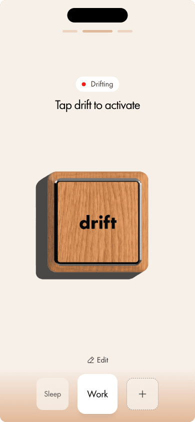
Designing for calm: We used warm natural tones, gentle animations, and sparse layouts to mirror the feel of the physical Drift object.
App integration: The app was designed around micro-interactions — nothing heavy, but meaningful moments: a gentle tap, a small animation, a soft sound to signify that pause.
3. Challenges We Faced
Balancing minimalism vs functionality: Stripping away features felt great, but it was hard to know when to stop — we wanted the app to feel useful but not addictive.
Tactile experience translation: Translating the physical feel of Drift into a digital interface was tricky — how do you make tapping a virtual button feel as calming as touching real wood?
Performance & load times: Even with a minimalist design, making sure Framer pages loaded quickly, especially for visitors on mobile, was a big concern.
4. What We Learned
Design matters at every scale: It’s not just about how something looks — how it feels and behaves is just as important.
Small rituals scale: A two-second pause, repeated every few hours, can really change how you feel across a day.
Build in public helps: Sharing early prototypes, getting feedback, and iterating with real users gave us direction and clarity faster than we expected.
5. What’s Next
New features: We’re working on very light reminders, but only if they feel gentle and optional — never naggy.
Community: We want to build a small, thoughtful community around Drift — people who care about focus, habits, and slow design.
Studio learnings: What we’re learning from Drift will also feed back into ForkLabs, how to design more meaningful, human-first digital products.